Developer David Smith has released a new app today called CalZones that is a combination calendar and timezone converter.
Available for $4.99 via the App Store for iPhone, iPad, and Apple Watch, the app makes it as easy as possible to see what time it is where somebody else lives and arrange a meeting at the correct time across timezones and work schedules.
I’ve never found a calendar app that lets me have timezones presets visualized so easily, giving me the correct the information of what time it is across the world, and packing an impressive amount of utility into multiple small spaces.
Here’s how Calzone accomplishes all that.
The main timezone grid view

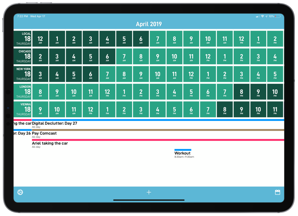
The CalZone app’s primary screen shows you selected timezones in rows and the time compared across in columns. Reading in a vertical line across the grid lets you easily see the same time across timezones, without doing the math in your head.
Part of how that grid gives you more context across timezones is by using colors – in the settings, you are able to select your “work hours”, which then are shown on the grid in a different color, as well as separation gradations for the morning or evening times.

As you scroll sideways, you can the see future times across locales and whether or not that time falls into available working hours. This is much more apparent on the iPad version as well, which stretches much wider than the phone.
While CalZones’s interface is slightly overwhelming interface at first, it starts to make sense in practice – you can scan the list vertically across timezones as you scroll horizontally through the different hours, using the colors to see as each timezone enters working hours and when a different one fall outs out of that range.

This color context helps tremendously if you’re trying schedule an event with people across timezones, not only getting the time right but helping you avoid potentially setting up a meeting at a non-work time for somebody else. Once you’ve found the correct time where everyone involved is on the clock, you can then tap on any time to schedule an event at in that timezone.
Plus, regardless of which person’s locale you tap on and create the event for, it show up in the calendar at the correctly localized time for you and the other attendees.
Calzones also has a clever way of showing existing events below the grid, showing horizontal bars across representing the length of the event. But what’s handy is that if you tap on the dropdown next to the event, it shows what time it occurs across the timezones you have selected.
Customizing the app
For each timezone you’ve added, you can also configure how to display the title for that timezone, giving it a phrase or name relevant to you.

To set this up Settings > Timezones, tap on the timezone to enter the detail screen. From there, the Custom Names section lets you change the display name (and the abbreviation, which is used on the Apple Watch, which I’ll get to in a moment).
For my uses, I am using CalZones to coordinate good times to chat with my friends Rosemary Orchard and Alex Cox. I occasionally chat with Rosemary about automation topics, but only after she is done with her work in Vienna, Austria, which is a 9-hour time difference.1
With CalZones, I can simply pick 7 PM her time and the event will automatically be set for me at 10 AM PST, without me having to think about it at all.
Plus, if I want to invite my podcast cohost Alex Cox to join us in the conversation, I can see when she is available in Chicago and pick a time across all three times zones easily.
I chose to keep the areas general in the main app, and added custom “Rose” and “Alex” abbreviations for the watch app (I’ll explain why below).
I’ve also added in the timezones for New York and London as a general East Coast and Europe reference, which can be helpful if I’m curious what time it is for some of my favorite podcast shows/hosts too.
For larger teams or group working arrangements, you could change all the display names to the names of your coworkers. That way, you could use CalZones quickly check what time it is per person and schedule meetings that work for both of you immediately. Or, the app suggests you name them with some unique meaning to you, like “Beach House” or “HQ”.
Secondary view
In addition to the main timeline, there is a secondary view that shows a more traditional calendar format. Each day shows dots representing the number of events per day, and below the monthly view is a list of the currently-selected day’s events.

Each event that doesn’t last all day will also display a drop-down arrow to show when that event occurs across timeszones, letting you quickly check when future events are going on for everyone else.
On this screen, I also noticed a neat little detail that lets you swipe in the blank space below on the left or right to move backwards or forwards – this means you don’t have to reach up and select each new day, instead gesturing through day-by-day.
This view is a little more minimal and pleasant if you’re looking further than a few hours ahead, and a helpful balance to tone down the load of information provided by the grid.
Widget
But the functionality of CalZones extends out of the app’s two main views and into the widgets and Apple Watch versions of the app.

The smaller view of the CalZones widget shows a dense version of the current Time across timezones, letting you basically see one column from the main app.
But once you tap Show More on the widget, it expandeds to show the full grid of hours across locales, your events down below, and even lets you tap the left and right side to I look forward in time further.
From there, you can also select the time and the app will open into the event creation screen – which effectively means you could use only the widget and avoid keeping the app on your home screen if you didn’t want to.
It’s a slight shame that the app widget has either a white or black background and doesn’t match the transparency of the other widgets, but otherwise it’s absolutely still a great addition to my widgets section.
The Apple Watch app
On the Apple Watch, there are even more features that round out this tool as a helpful utility worth picking up.

First, the app itself shows the current time and date across timezones, color-coded visually the same as the main app according to Work Hours, morning, and evening hours. Swiping to the right will also show the current events for the day, albeit display only in your current timezone (likely for information density and practicality reasons).
What’s neat about the Watch app is also the ability to spin the digital crown hardware on the Apple Watch to adjust the timezone. Spinning it up will move back in time, and spinning it down will move forward in time – plus, the colors shift as well, so you can rely on that visualization to see whether someone is “online” or not, right from your watch.
This is a truly useful utility for the watch, where applications aren’t always worth jumping into or don’t take advantage of features like the digital crown – as usual, David Smith has made a Dock-worthy Apple Watch app.
Multiple timezone Complications
But of course, he didn’t stop there – David has set up the ability to customize all the “complications” widgets that show on the watch faces. Inside the app, you can view each type of watch face and have a different complication for every one, which—for someone like me who likes to fiddle with these things—presents a whole multitude of options.

The complication configuration screen even includes a Slow/Fast mode that you can use to test how each complication works at different times of day, which definitely helps speed up the process of deciding which to add yourself instead of testing and retesting over and over on your watch.
The options available to add to the watch are super unique – with the CalZones watch app, you can add put the following on your watch faces:
– the current time in a specific timezone
– daylight hours, from sunrise-sunset
– a visualization of your progress through your Work Day hours
– sun & moon, which is 6am-6pm (along with an accurate moon phase)
The current time complications can go beyond just displaying a single timezone of your choice (like the built-in Clock complications can already do).
For watch faces with wider display areas, you are able to add up to three times zones to display in the same spot, adding more information density as needed, along with your custom display name abbreviations.
Work Day complication
I prefer favorite the Work Day graph, which shows my current progress through the length of the work hours I have selected.
This chart doesn’t line up with the specific hours on the clock, but instead visualizes progress through the general arch of a “day”, regardless of when exactly that happens for you.

I set this up for my own working hours so that I can quickly glance down and see how far I am throughout the work day, without actually focusing on the time itself.
As an independent worker, instead of framing my work hours to the arbitrary 9-5, I can check time elapsed through my own day.
This helps me avoid working along to random time horizons like noon or 3pm as well. Instead, I can stay on focused on what I need to do and not where a clock nicely lines up visually – which, if you think about it for a few seconds, is quite a silly thing to do.
What’s even cooler about this Work Day feature is that you can set it to somebody else’s working day and see how far they are into their work day.
It took me a second to wrap my head around this, but in effect, I could set this up for Rosemary’s available hours in the evening, then quickly check on my watch if she is still free to talk, rather than scheduling a specific time and planning my day around that.
These are super unique features I haven’t seen elsewhere, and I could CalZones taking this even further in the future versions of the app.
For example, I would love the ability to set working hours for each individual timezone, so that I could set up both Rosemary and Alex is working hours instead of using my own across all the timezones. Or, perhaps the Apple Watch visualization could even somehow show the overlap between the two – that would be neat.
Other complications
The Apple Watch complications also have the ability to show sunrise and sunset times, which could be useful for tracking available light for photography or video production, plus options for the sun and moon phases for a selected times zones.
However, I generally didn’t find myself drawn to them, as the graphics in the complications progress from right to left instead of left to right – that goes against how I generally grasp visualizations.
There’s another complication option for work schedules too that, in place of showing a set portion of time and the progression through it, instead shows a shrinking slice of the pie – but it shrinks to the left throughout the day too, which I find odd.
One fantastic watch app
The sunrise/sunset complication has a visualization for the full day, so I’ve added that to a watch face I use to keep track of weather conditions.
For all the other faces, I have the complications to show my Work Day visualization, and can always jump into the app to view all the timezones.
With all of these Apple Watch features together, I suspect I will use the watch app more than the main app itself.
Since I don’t need to schedule as much as I’d just like to know the information, the multitudes of complications and the Digital Crown feature will prove useful enough for my needs – it’s definitely a handy addition to my Apple Watch app roster.
Details of CalZones
Before I wrap up, there are some other small details that I noticed or could improve the experience in future versions:
- Theming: There is a dark mode that inverts the colors of the backgrounds, and adjusts to the alternate palette from the color you chose. You can also change the app icon to corresponding color schemes and in light/dark options, which is nice. I really like that David Smith included a colorblind specific option for people who might need it.
- Animations: There’s lots of little animations throughout the app that add to the experience of using it – moving across months makes the title bar slide up as the current month swaps out of view, longer events will bound to the edges as you swipe sideways, and changing the timing or repetition of new events bounces nicely as well (along with a unique Repeat view, to boot).
- Jump to Top: Tapping the Title Bar showing the month and year also takes you to the current date, which is handy if you’ve scrolled far into the future and want to jump back to today.
- Custom Work Hours per timezone: I mentioned this above, but setting custom Work Hours per timezone would be a killer feature. You could use CalZones to manage an entire remote team, specific to each person’s preferences, all from your watch even – I really hope this gets prioritized.
- Work Hours timing: Work hours can only be set in hour-long increments – I’d like to be able to customize these further, since Rose is generally available until 11:30 my time, and I myself start around 8:30. This probably screws up the simplicity of the color visualizations, but maybe a diagonal slash for half-hours or four smaller squares for 15-minutes chunks would do the trick.
- Scheduling events doesn’t include attendees: I’m not sure if this is by design, but you can’t add people to your calendar events from CalZones. It seems to be more for planning than setting up meetings specifically, so you’d have to go into a different calendar app once the event is created and invite people. There might be a way to automate this a bit with Shortcuts, but having this native to the app would be beneficial.
- No Siri Shortcuts support : Speaking of Shortcuts, there’s no type of Siri Shortcuts donated to the system or special Shortcuts tricks using the clipboard or calendar events. It’d be handy to copy the current timezones to the clipboard or have CalZones tap into the next calendar event and return the times for that in each timezone.
- Sync: There also doesn’t appear to be any type of iCloud Sync, so you’ll have to set it up again on an iPad or new device – not a big deal though, as there are only a few settings, but worth noting for the setup process.
Should you enter the CalZones zone?2

Once I bought it and played around with it, CalZones moved right to the top of my list of recommendations for calendaring and remote work management.
If you’ve ever struggled with scheduling across timezones, this app is a no-brainer purchase. And for many, this could easily be another killer app for their Apple Watch too.
If you work with anyone who isn’t in the same timezone as you, chances are the $5 that this app costs will be instantly be returned to you in time not wasted figuring this out every day – not to mention the frustration avoided.
I could see CalZones being useful to any employee of an international corporation, multitudes of people coordinating with others across the Internet, and even for those just curious about what’s going on elsewhere around the world.
David Smith make some of the most practical utility applications of any developer, most especially for the Apple Watch, and especially for version 1.0, he has nailed it again with CalZones.
Now if there was an in-app purchase for a custom calzone-themed app icon, it would be just perfect.
- We’ve definitely had multiple conversations where she either reminds me what timezone she’s in, or we have to reiterate when we are meeting just to make sure we’re not miss scheduling. ↩
- No joke, I have a HomeKit zone named “Calzone” set only for the kitchen, so I can say “Turn on the Calzone zone” when it’s time to make pizza.
I am a dork, and Parks and Recreation is a fantastic show. ↩
