On Saturday, there was a post going around about the App Store logo not making sense, moving from distinguishable icons to an abstract “A”:
the app store icon doesn’t even make sense anymore. Its just three sticks in a triangle????
I quoted it with the following explanation, including context for the same technique in Shortcuts:
The App Store icon is made up of three app icons supporting each other (like apps on the App Store do)
Just like the Shortcuts is two app icons, connected in the middle (like shortcuts connecting your apps together) https://t.co/cOc7MgUmZo pic.twitter.com/uYJ5b5dRcR
— Matthew Cassinelli (@mattcassinelli) November 8, 2025
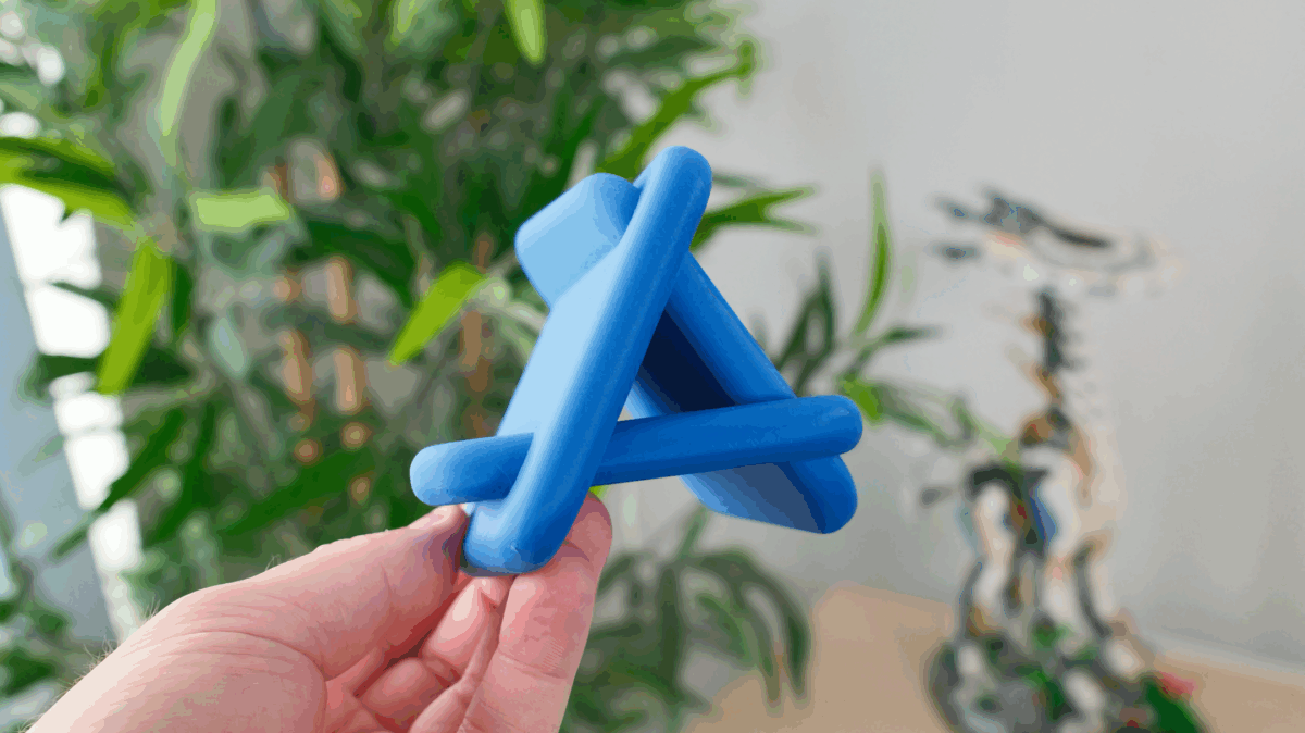
Christian Selig, creator of Apollo for Reddit and Pixel Pals, went a step further and apparently spent the evening fully designing, printing, and sharing a 3D model of the App Store logo using his 3D printer:
Nooo, the App Store logo is cleverly made from 3, tilted app icons. I made a little 3D printed model to visualize it, makes for a cool desk ornament https://t.co/OLXPBE33gZ pic.twitter.com/agcncxvEdZ
— Christian Selig (@ChristianSelig) November 9, 2025
Christian is the best – I love that he went all out on this model immediately, as it’s very effective at demonstrating the angles of the icons:
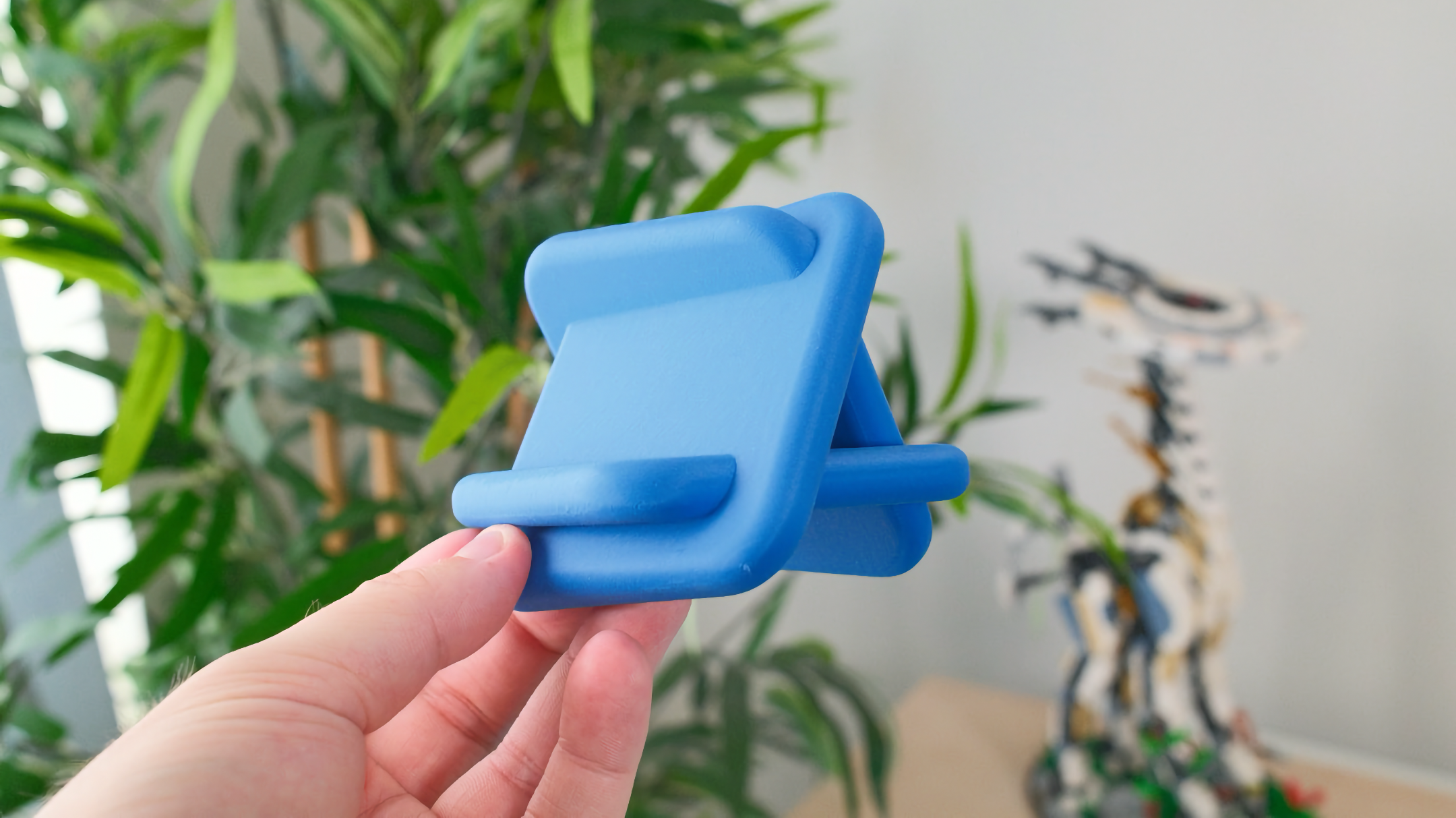
Christian has published a ton of other models worth checking out, including a Mac Pro-inspired PC case, a Mac mini plant holder, and a stand for Apple Vision Pro. Naturally, I’ve requested a Shortcuts version—😇—though not sure how feasible it is since the design doesn’t have as much intersection.
These aren’t the only apps with this style as well – X user Dylan mentioned that the TestFlight icon has the same effect:
better example is the testflight icon which is for beta version of apps on the *app store* pic.twitter.com/ngfC0vE9RX
— Dylan (@enemy_4u) November 9, 2025
Edit: More updates from Edward Sanchez, former designer at Apple – the original version is indeed a 3D rendering:
I hereby raise a challenge to any 3D artist to correctly recreate the app store icon based on the Instruments icon mesh – and show a 360 rotation of it. It’s surprising, and as you can see, not sticks. I can’t share the source, but I can reward the winner with a like and retweet. pic.twitter.com/fejVd5yTTt
— Edward Sanchez (@edwardsanchez) July 1, 2020
However, with Liquid Glass, it has in fact been reduced to three popsicle sticks:
Liquid Glass version it’s just 3 glossy fancy popsicle sticks intertwined. Not as nice 😜 pic.twitter.com/xBK3HwhUcJ
— Edward Sanchez (@edwardsanchez) November 9, 2025
My take? The spirit of the post is correct—the logo is made up of app icons—regardless of the current iteration.
Second edit: Here’s the original rendering from designer Mark Edwards that inspired the model:
Maybe like this? pic.twitter.com/MVCWvXI0AX
— Marc Edwards (@marcedwards) July 1, 2020
See the original post, check out my quote tweet, and see Christian’s video post – plus, get the 3D model of the App Store logo on MakerWorld.