Earlier this summer, I filed a Feedback report to Apple under FB12491762 with the title “The Up Next queue should have a dedicated full view,” something they’ve now added in iOS 17.4 developer beta 1 to the TV app.
In my report, I included the following description:
TV app users who take advantage of the Up Next queue might find themselves with a long queue and only a single-file list on the main Watch Now tab in order to view the full list.
I propose that Apple add a “tap-in” for the Up Next queue that brings you to a grid view of the shows/ movies, allowing users to see their whole Up Next queue at once.
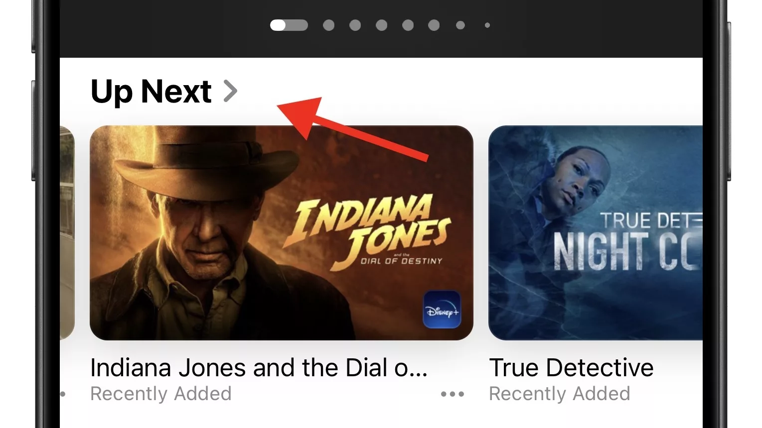
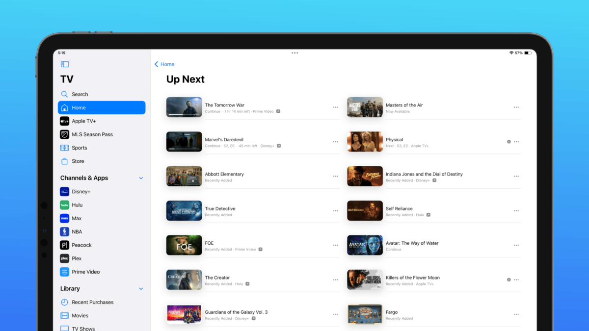
What was previously only a sideways-scrolling view in the TV app now has a sub-menu, represented by a sideways chevron (>) showing that you can tap in and see a dedicated view.
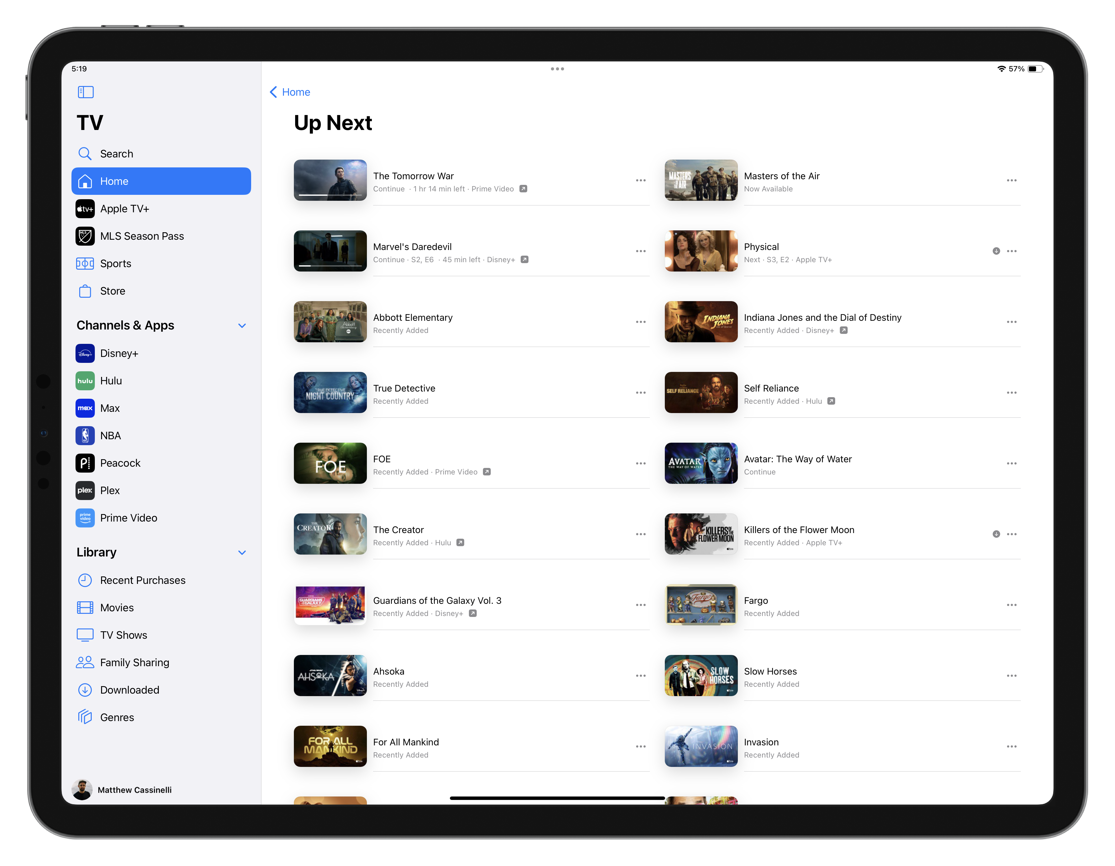
In that view, which is a single column on iPhone and a double column on iPad, you can see the show art, title, status (recently added, next, continue), as well as the streaming service (if applicable) – and a menu button that lets you act on the TV show or movie.
Currently, there are no swipe gestures in this view, which could have let you remove items from the list quickly – perhaps that doesn’t work in the dual-column view on iPad.
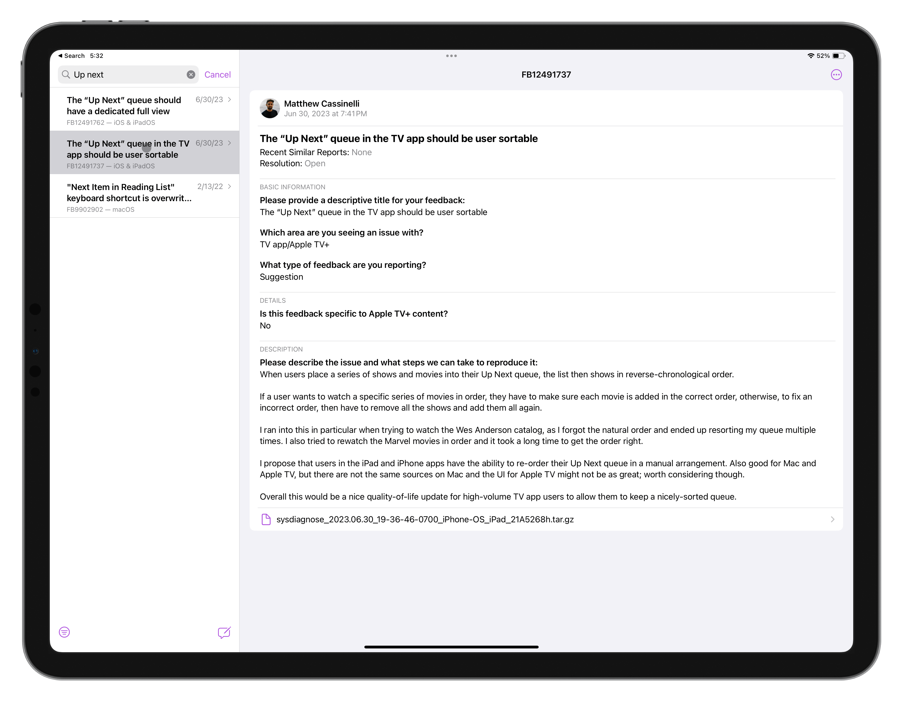
My original report also included a reference to another Feedback report—FB12491737 (The “Up Next” queue in the TV app should be user sortable)—that I filed separately asking for the Up Next list to have a manual sort option.
Right now, this new dedicated view is determined by the order you add things to the list, and you can’t change it later without removing things and re-adding them. Unfortunately, Apple didn’t add this manual sorting functionality either – something I hope they consider in future versions of iOS.
Even still, this just goes to show – you should file Feedback to Apple asking for features you want added!
