Categories
Apps

Easily Design Custom Stream Deck Icons with Button Creator for macOS

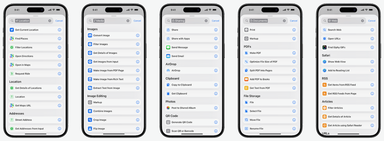
If you find yourself creating custom buttons on the Stream Deck from Elgato, you will likely run into an issue – how do I create icons that fit my style?

button-creator-stream-deck-iconselgato-marketplacescreenshot

Elgato helpfully provides a dedicated section for Stream Deck icons in their Marketplace, where you can install icon packs from a variety of creators across various categories – this is a great one-and-done solution to get icons at-scale.

If you’re looking for further customization, however, you might end up in that awkward gap between trying to design your own in tools like Canva or Figma, or feeling like you’d need to request an entire custom set from someone with more creative skills than yourself (this is about me).

button-creator-stream-deck-iconsmac-app-storescreenshot

Instead, developer Christian Lobach has a solution for Mac users – the Button Creator for Stream Deck app, which lets you use a simple interface to create your own icons.

button-creator-stream-deck-iconsinterfacescreenshot

With Button Creator, you can customize the foreground or background colors, pick a glyph using the SF Symbols library, emoji, or your own images, and even customize a text label so you don’t have to duplicate the title in the Stream Deck app.

button-creator-stream-deck-iconstemplatescreenshot

Plus, you can save your creations as templates, making it easy to start again with the same style and have a consistent look across your icons.

button-creator-stream-deck-iconspixelmator-pro-gradientscreenshot

So far, I’m quite happy with the customization features of Button Creator – there’s lots of control and, in most places, more than enough for what I need. I’d like to see more text styling controls, and I’d potentially also like more Gradient controls, including the option to change the rotation by a specific degree, change from linear to radial or angular, and handles to control the placement. Admittedly, that might be a lot for what’s otherwise a simple app, but it’d add a cool layer of customization – I’ve been trying to make better gradient maps in Pixelmator Pro and want to get really nice-looking icons over time.

button-creator-stream-iconshortcutscreenshot

Otherwise, Shortcuts support could take this app very far – letting me pass in parameters and output icons would be incredibly powerful, and I could programmatically create icons for my entire library in seconds. Right now I’m able to use Get My Shortcuts to export exact icons, but without any customization – combining that with Button Creator actions could let me automatically apply short titles and avoid manually adding them in the Stream Deck app, for example.

button-creator-stream-iconsadd-to-home-screenscreenshot

As you can guess from the name, Button Creator for Stream Deck is, well, designed pretty specifically for Stream Deck users – however, these icons can also be repurposed as Home Screen icons using the “Add to Home Screen“feature in Shortcuts on iPhone and iPad – or for any other purpose, for that matter.

Get Button Creator for $4.99 on the Mac App Store and check out the Stream Deck from Elgato.

Note: I am an Elgato Partner – this post uses my partner URLs for Elgato links.

Categories
Gear

I Just Got Elgato’s Bright, WiFi-Enabled, Desk-Mounted Key Lights »

From @elgato:

Cooking streams looking dim?

Brighten your workspace with Key Light, Key Light Air, or Key Light Mini. 💡

I just got two Key Lights and mounted them to my desk – it immediately enabled me to take down my big softbox light in between videos.

Controlling the brightness and color temperature from Elgato’s “Control Center” app on iOS and Mac is excellent too.

View the post and get the Key Light from Elgato.

P.S. You can use my Elgato Partner code ZZ-CASSINELLI for 5% off at checkout.


Categories
Membership Video

Apple Vision Pro Unboxing: Member Video

Hey members! I have a special new video for you – my unboxing experience with the Apple Vision Pro, available now privately through YouTube.

Hey members! I have a special new video for you – my unboxing experience with the Apple Vision Pro, available now privately through YouTube.

Coming in at a little under an hour, I tried to capture a simple walkthrough and first-run experience with the device – complete with small observations, initial confusions, and the inevitable screen recording issues.

I’ve included chapter markers so you can jump through and watch the most interesting bits, and will clip out my favorite moments as well – for example, the first good screen recording starts at 35:22 in.

Admittedly, this may not be a thriller to watch from start to finish; but, I am experimenting with deeper access videos like this, as well as testing different filming techniques or editing processes – this is shot in a 4:3 aspect ratio, for example. Plus, since I don’t have to optimize for a massive audience or “the algorithm,” I can be a little more relaxed and natural, like the way I settle into things during livestreams.

I loved this initial test of a members-only video, and I hope you enjoy it too – let me know if you’d like to see other videos like this in the future!

Become a member to get access to access to the video, plus:

  • New shortcuts on an ongoing basis
  • Extra ways to browse the catalog when you’re signed in
  • Prerelease notes & workflows I’m putting together

Categories
Gear

Attention Apple Fans: Elgato’s Acoustic Wave Panels Now Come In White »

From @elgato:

ICYMI, we released Wave Panels in white.

These acoustic panels are stunning and easy to install. 😌 🛒: https://elgato.sjv.io/wave-panels-white-mjc

[Video]

I’m requesting Wave Panels from Elgato later this year, but I still haven’t decided if I want white or black…

View the post and get the Wave Panel Starter Pack in White from Elgato.

P.S. You can use my Elgato Partner code ZZ-CASSINELLI for 5% off at checkout.


Categories
Links

25 Apple Vision Pro Secrets & Hidden Features from Andru Edwards

Good set of Apple Vision Pro tips from Andru Edwards on YouTube:

Here’s your key to unlocking the full potential of the Apple Vision Pro secret features. Get a look at a bunch of hidden features that Apple has seamlessly integrated into this device. From discovering quirky Easter eggs in various Environments to mastering the use of spatial audio in FaceTime calls, these Apple Vision Pro tips and tricks will change how you use your Apple Vision Pro.

You’ll also learn how to effectively utilize the unique gesture controls, optimize your device for the best viewing experience, and much more. Don’t miss out on the bonus feature at the end, showing you how to get the perfect fit with the solo knit band vs dual loop band.

CHAPTERS

00:00 – Apple Vision Pro Secret Features

00:18 – Apple Vision Pro Environment Easter Eggs

00:50 – Apple Vision Pro Environments Have Different Sound Profile

01:14 – Change Volume of Environments

01:33 – Apple Vision Pro Apps Will Stay Where You Leave Them

02:25 – Transport Apps

02:46 – Bring Apps With You

03:07 – Touch Vision Pro Apps

03:39 – Apple Vision Pro Pinch and Hold Gesture

04:09 – How to Force Quit Apple Vision Pro Apps

04:30 – Apple Vision Pro Light Seal Cushions

05:11 – Increase Apple Vision Pro FOV

05:47 – How To Enable Apple Vision Pro Guest Mode

06:32 – Mirror Apple Vision Pro Display

06:58 – Fast Charge Apple Vision Pro

07:29 – Free iTunes Library 3D Upgrades

08:19 – Apple Music Mini Player

08:58 – Make A Better Apple Vision Pro Persona

10:28 – Apple Vision Pro Personas Work In Several Apps

10:44 – How to See Your Own Apple Vision Pro EyeSight

11:17 – Separate Volume Settings in Apple Vision Pro

11:36 – Use Mac Keyboard u0026 Trackpad with Apple Vision Pro Apps

12:04 – Solo Knit Band vs Dual Loop Band

I knew you could AirPlay to Mac displays, but I’ve never had an iPad or iPhone open while trying to share my view – perhaps there’s a convoluted solution for live-streaming here where I film my iPad screen showing what I’m doing in visionOS…

View the video YouTube.

Categories
Apps

Check Out 26 New Apps for Apple Vision Pro From These Developers

On Friday, for Apple Vision Pro release day, I called for developers to share their new apps for the platform – below are those results:

P.S. Make sure to check out the Threads links and follow the developers!

  1. MindNode Next – Spatial brainstorming: App Store | Threads | Web
  2. Odio – Soundscape ornaments: App Store | Threads
  3. LongPlay – Album art wall: App Store | Threads
  4. Spatial Sprinkles – Confetti cannon: App Store | Threads
  5. RuneStone – Text editor: App Store | Threads
  6. Day Ahead – 3D calendar timeline: App Store | Threads
  7. Liftoff – Watch space launches: App Store | Threads
  8. Bills to Budget – Expense and spending tracker: App Store | Threads
  9. Finalist – Daily Planner: App Store | Threads | Web
  10. Magnet Crop – Crop screenshots: App Store | Threads
  11. Flowriter – Writer’s retreat: App Store | Threads
  12. STAK! – Spatial stacking: App Store | Threads
  13. Cricket Scores Live Matches – Game tracker & visualizer: App Store | Threads
  14. Spindown – Life tracker: App Store | Threads
  15. PDF Viewer – Annotation expert: App Store | Threads | Web
  16. Project Graveyard – Final resting place for abandoned projects: App Store | Threads
  17. Kineo – Flipbook Animations: App Store | Threads
  18. TimeCube Spatial Clock – 3D clock: App Store | Threads
  19. Cone of Shame – Restrict your peripheral vision: App Store | Threads
  20. Citations – Lightweight reference creation: App Store | Threads
  21. Chronicling – Life logging/habit tracker: App Store | Threads
  22. Sequel – Media tracker: App Store | Threads
  23. Spatial Effects – FX particle emitter: App Store | Threads
  24. Mango 5Star – View your 5-star reviews: App Store | Threads
  25. Spruce Up – Decorate your shared space: App Store | Threads
  26. Vibescape – Immersive meditation: App Store | Threads

Also, this is by no means a comprehensive list of Apple Vision Pro apps I’m testing – I have many, many more installed currently. Come back to the Apple Vision Pro tag on my site for more coverage soon!

View the original post on Threads.

Categories
News

Announcement: I am an Elgato Partner for 2024!

Hey everyone! I’m excited to announce that I’ve agreed to be an Elgato Partner for 2024, where I’ll be working with the brand throughout the year to share about new gear and how to use it for Mac users in particular.

I’ve long been a fan of Elgato and have been sharing for over 5 years about the Stream Deck and how great it is for Apple users, starting from using it simply as a streaming device, morphing into a daily productivity tool and, then fully evolving into a tool for complete access to all my shortcuts.

Before I ever thought about partnering with Elgato, I’ve thought the Stream Deck was the ultimate macOS accessory – now, I get to work with them directly to help more people reap the benefits (of all their other products too).

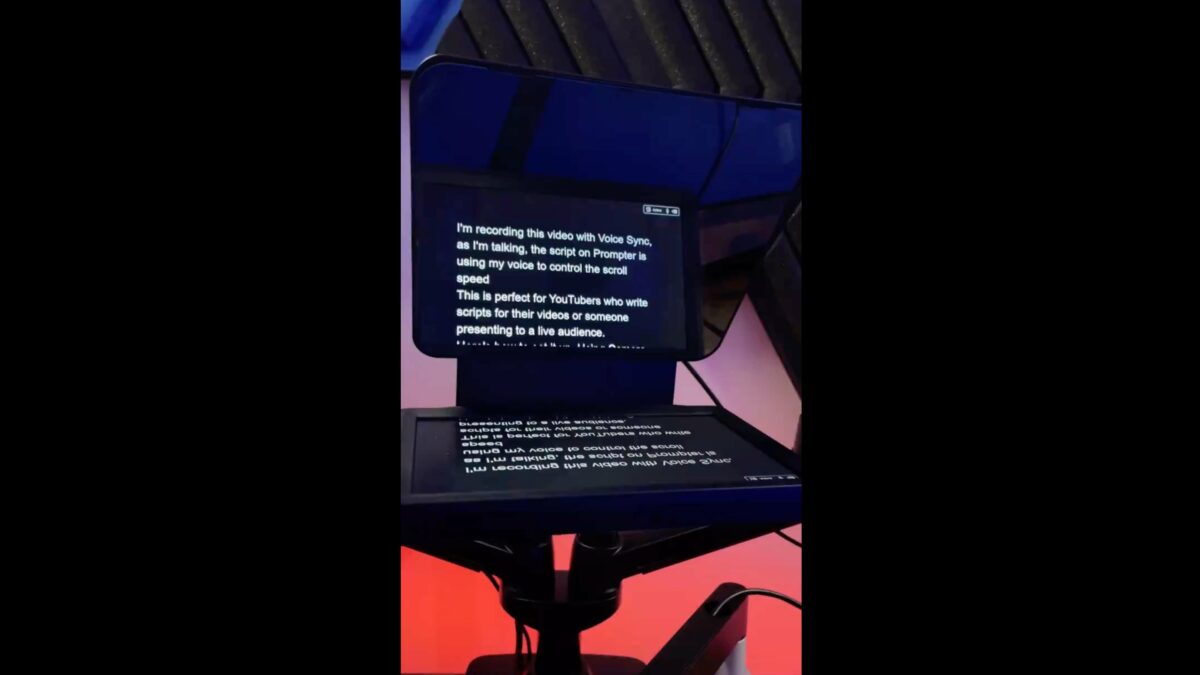
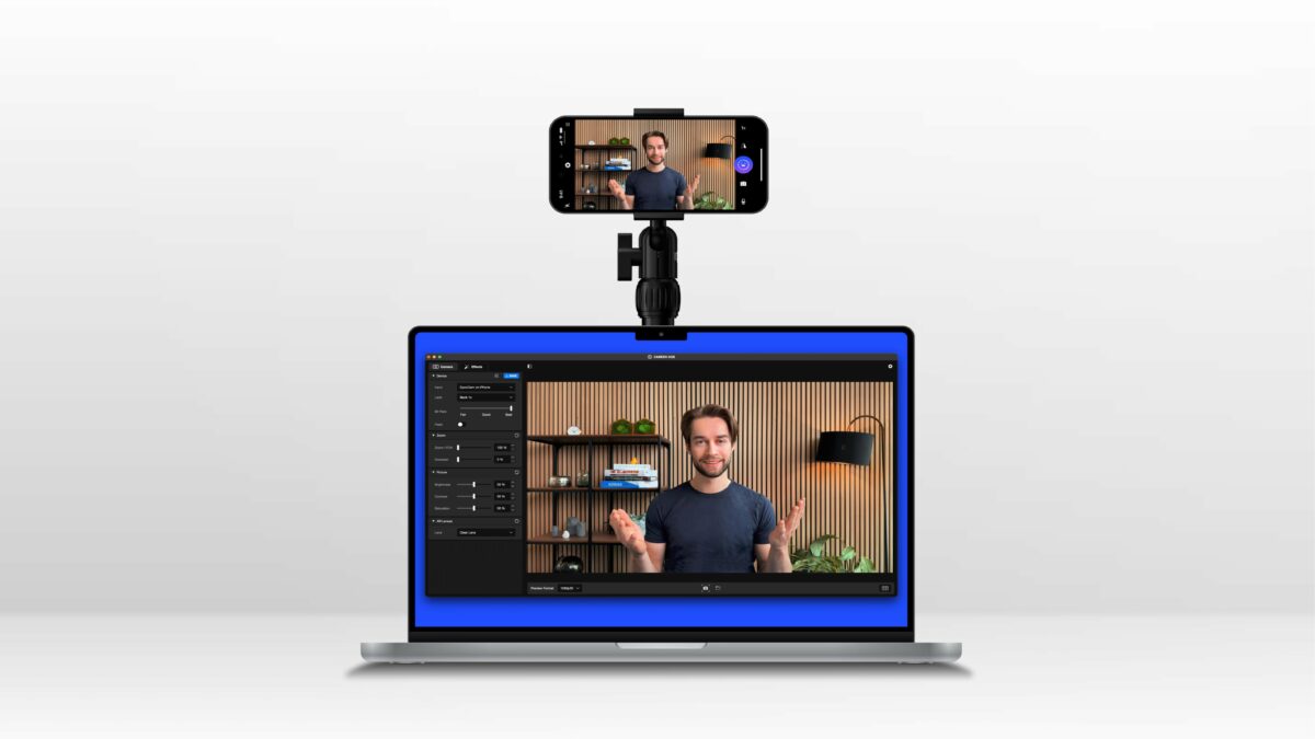
Plus, with my partnership, I will soon be able to offer my community 5% off all Elgato products, even beyond the Stream Deck – they make capture cards, lights, webcams, green screens, mounts, teleprompters, and even acoustic panels for audio treatment.

Once the discount is available, I’ll update this post – I’ll also include it when I share product links in the future.

Throughout the year, I’ll be sharing different tips and tricks, unboxing and setting up new gear, and building out different setups for Elgato’s Marketplace, where you can download Profiles for the Stream Deck and install them yourselves – look for #ElgatoPartner on relevant posts.

Plus, I have long been developing Stream Deck profiles for my own shortcuts to share – there’s lots of fun opportunities ahead.

Thanks to Elgato for the opportunity – I hope you all take advantage of the upcoming discount should you choose to get something after seeing my work! And let me know if you have any questions – I’m happy to help guide you to the right solution 🙂

Categories
Links

Shortcut Buttons For Apple Vision Pro Puts Floating Automations In The Space Around You

Finn Voorhees, developer at Detail and creator of apps like Unsqueeze and Castaway, has announced an app for Apple Vision Pro called Shortcut Buttons. The app, available now, lets you place a floating tile for a shortcut in your spatial computing environment and run it instantly – how freaking cool is that?!

According to the site, here’s what Shortcut Button is for:

Shortcut Buttons is great for placing relevant automations nearby when working on notes, calendars, tasks, and other productivity apps. You can avoid switching over to the shortcuts app running in iPad compatibility mode and instead just tap a small nearby button, similar to how you might run a shortcut from the Shortcuts widget on iOS/iPadOS.

Shortcut Buttons is also useful for setting up home automation shortcuts in relevant places. Easily dim the lights or order food when watching a movie, or start a timer when cooking in the kitchen.

With Shortcut Buttons, you can place as many shortcuts as you want, which will anchor-in-place in your spatial computing environment, making it easy to launch your shortcut from anywhere, just by looking at it.

Plus, you can style your Shortcut Buttons according to your preferences, making sure they fit into your environment nicely.

Particularly useful will be the clipboard access, which will let you copy something in visionOS and send it to the Shortcut Input of your shortcut – while browsing for recipes in your kitchen, you could easily copy one and send it to your Recipes list with your Shortcut Button floating over the countertop.

The History view is also incredible, because most Shortcuts users run the same shortcuts over time – this will be super handy for your most-used shortcuts on Apple Vision Pro.

Shortcut Button is available for Apple Vision Pro for an up-front price of $7.99 – a small fee that’s certainly worth it for such a perfect spatial computing utility.

Check out the Shortcut Buttons site, get Shortcut Buttons on the App Store, and view the launch post on Mastodon.

Categories
Links

YouTuber Personas Take FaceTime Call on Apple Vision Pro

Shared alongside with their videos today, YouTube creators iJustine, MKBHD, and Brian Tong appeared in a FaceTime call together to discuss Apple Vision Pro – or, should I say, their Personas did?

On Justine’s page, she posted a video of the call as the three demo their Personas, generated from scans taken with Apple Vision Pro, where Marques Brownlee says:

The faces are impressive… I think…

It’s very, very… it’s just at the edge of uncanny valley. I know what you guys look like so I know they look like you…”

The effect is almost unsettling, and yet obviously them – it’s sort of like a previous generation video game character version of each person.

Brian Tong says:

I feel like this is a 9/10 to how we actually look

And Justine agrees, continuing:

It’s pretty good. And also skin tones too, because all three of us have very different complexions and I feel like it actually (laughs) It actually did a pretty good job.

Marques continues:

Every single time I’ve gotten on a FaceTime call with this, it’s the same reaction of “Whoa!” Like, “This is weird…

And I realize I’ve gotten used to it, and I think after a while everyone using this is just going to get used to using it after getting over the initial “Holy crap, look at this thing.”

View the video clip or watch the segment in Justine’s full video.


Categories
Links

Joanna Stern wears Apple Vision Pro on Live TV

Joanna Stern, journalist at The Wall Street Journal, made a live TV appearance today while wearing the Apple Vision Pro on CBNC’s The Squawk on the Street:

“I think this is a Apple die-hard product right now.”

@WSJ columnist @joannastern joins @SaraEisen and @CarlQuintanilla to break down her review of Apple’s new headset: the Vision Pro. $AAPL

Iconic.

Check out Joanna’s review (web, YouTube), which stands out among the list of early reviewers, and view the video on CNBC.com or X.

Categories
Links

PSA: Test your App Shortcuts via Siri on Apple Vision Pro

From Emmanuel Crouvisier , developer of CardPointers:

PSA: Test your App Shortcuts via Siri on Apple Vision Pro if you’re shipping on Friday.

A bunch of things don’t work, including NavigationLink, GroupBox, and more, resulting in the “McDonald’s box of death”.

Once you’ve tweaked them though, they feel so great.

As for the “McDonald’s box of death,” Emmanuel describes it in another reply:

Haha yellow box with the red slash across it. What you surely saw with your widgets when iOS 17 came out and didn’t have the widget background stuff set.

View the full thread, plus learn about Cardpointers on the web or get it on the App Store.

Categories
Links

John Gruber: “The Vision Pro”

Gruber being Gruber, for Daring Fireball:

For the last six days, I’ve been simultaneously testing three entirely new products from Apple. The first is a VR/AR headset with eye-tracking controls. The second is a revolutionary spatial computing productivity platform. The third is a breakthrough personal entertainment device.

A headset, a spatial productivity platform, and a personal entertainment device.

I’m sure you’re already getting it. These are not three separate devices. They’re one: Apple Vision Pro. But if you’ll pardon the shameless homage to Steve Jobs’s famous iPhone introduction, I think these three perspectives are the best way to consider it.

I also like this bit:

You can do seemingly crazy things like put a VisionOS application window outside a real-world window.

Read the full post on Daring Fireball.

Categories
Apps Links

Ulysses Writing App Adds New Home Screen and Lock Screen Widgets »

From the Ulysses v34 release notes, quoted via 9to5Mac:

Widgets on iOS:

  • Better late then never…
  • Open projects right from your home screen.
  • Create new sheets right from your home screen.
  • Both actions are also available for your lock screen.
  • There‘s even a dedicated Inbox widget, which works similar.

I’m very, very, very appreciative of these initial widgets—check out my Writing widgets in the post header image—and have even sent detailed feedback to the team asking for more access to Groups (since I don’t use Projects) 😇.

View the story on 9to5Mac and buy Ulysses on the web or get it the App Store.

Categories
Links

Blackbox: Rebooting an Inventive Puzzle Game for VisionOS »

From the Apple Developer blog:

If you’ve ever played Blackbox, you know that Ryan McLeod builds games a little differently.

In the inventive iOS puzzler from McLeod’s studio, Shapes & Stories, players solve challenges not by tapping or swiping but by rotating the device, plugging in the USB cable, singing a little tune — pretty much everything except touching the screen.

“The idea was to get people in touch with the world outside their device,” says McLeod, while ambling along the canals of his Amsterdam home base.

In fact, McLeod freed his puzzles from the confines of a device screen well before Apple Vision Pro was even announced — which made bringing the game to this new platform a fascinating challenge.

I briefly had the chance to talk with Ryan at WWDC after it was announced he’d been developer for the device in early access, and it got me thinking about how Shortcuts could work in spatial computing – fascinating to consider.

This image of his notebook from the story is very cool to look over in particular.

View the full story on the Apple Developer site.

Categories
Links

Apple Vision Pro Early Unboxings and Reviews

Apple Vision Pro is available this Friday, which means the typical Tuesday-before set of pre-release reviewers are sharing their thoughts – some are unboxings, while some are full reviews.

Here’s the set of reviewers that got early access (listed in order I came across their links):

  1. Nilay Patel of The Verge: Web | YouTube
  2. Marques Brownlee/MKBHD: YouTube
  3. Justine Ezarik/iJustine: YouTube
  4. Brian Tong: YouTube
  5. Joanna Stern of The Wall Street Journal: Web | YouTube
  6. Scott Stein of CNET: Web | YouTube
  7. Mark Spoonauer of Tom’s Guide: Web | YouTube
  8. Todd Haselton of CNBC: Web
  9. Carolina Milanesi of Creative Strategies: Web
  10. John Gruber of Daring Fireball: Web

View the Apple Vision Pro on Apple’s website.

Update: Included Carolina Milanese’s coverage, which I initially missed.

Update to the update: Included John Gruber’s coverage, which was published after this was released.

Categories
Feedback

Apple Adds Dedicated View for Up Next in TV App

Earlier this summer, I filed a Feedback report to Apple under FB12491762 with the title “The Up Next queue should have a dedicated full view,” something they’ve now added in iOS 17.4 developer beta 1 to the TV app.

In my report, I included the following description:

TV app users who take advantage of the Up Next queue might find themselves with a long queue and only a single-file list on the main Watch Now tab in order to view the full list.

I propose that Apple add a “tap-in” for the Up Next queue that brings you to a grid view of the shows/ movies, allowing users to see their whole Up Next queue at once.

What was previously only a sideways-scrolling view in the TV app now has a sub-menu, represented by a sideways chevron (>) showing that you can tap in and see a dedicated view.

In that view, which is a single column on iPhone and a double column on iPad, you can see the show art, title, status (recently added, next, continue), as well as the streaming service (if applicable) – and a menu button that lets you act on the TV show or movie.

Currently, there are no swipe gestures in this view, which could have let you remove items from the list quickly – perhaps that doesn’t work in the dual-column view on iPad.

My original report also included a reference to another Feedback report—FB12491737 (The “Up Next” queue in the TV app should be user sortable)—that I filed separately asking for the Up Next list to have a manual sort option.

Right now, this new dedicated view is determined by the order you add things to the list, and you can’t change it later without removing things and re-adding them. Unfortunately, Apple didn’t add this manual sorting functionality either – something I hope they consider in future versions of iOS.

Even still, this just goes to show – you should file Feedback to Apple asking for features you want added!

Categories
How To Shortcuts

How To Check Your App Store Subscriptions with Reminders and Shortcuts

This morning, I saw creator Tyler Stalman talking about his app subscriptions, giving a tip about free trials:

Pro Tip: first thing I do when I sign up for an app free trial is immediately cancel it

The trial period still works & if I don’t end up using the app I’ll probably forget to cancel the subscription before I get charged

If I do like it I’ll be sent a reminder to renew

If you’re unsure about new subscriptions and want to evaluate the true value of your apps, this is a great strategy.

I have a technique (which I shared in the replies) to access this same page using Shortcuts, plus set a reminder to run that shortcut regularly – using my Check My App Subscriptions shortcut.

This shortcut uses a deep link into the App Store’s infrastructure, taking the URL itms-apps://apps.apple.com/account/subscriptions and opening the link using Open URLs. When run, Shortcuts opens the URL into the App Store page, showing your list of current subscriptions – including those trials you may have cancelled by default using Tyler’s method.

Once you have the shortcut in your collection, you can ask Siri using the name of the shortcut (which you can customize to your own preferred trigger phrase) and open right to this page at any moment. Or, you can keep it in an instance of the Shortcuts widget – I have mine in a small widget to the left of my Home Screen in a widget stack that I can rotate to when needed.

If you really want to stay on top of your subscriptions, however, I recommend using a little-known technique involving Shortcuts, Reminders, and Siri’s capability to “Remind me about this” – which you can use with Shortcuts to create a special button in your new reminder that, when tapped, opens Shortcuts and runs the shortcut.

With my “Check My App Subscriptions” shortcut open, you can ask Siri to “Remind me about this” (and even “Remind me about this once a month”) to create the special reminder.

Then, you can customize the details like putting it in a different Reminders list or making the reminder repeat on a schedule – once on the weekends, or monthly on the 15th or the last Sunday are good starting points.

Get the Check My App Subscriptions shortcut in the App Store folder of my Shortcuts Library, and check out Tyler’s original post.

Categories
Editorial Feedback

Transcripts Are Great; Add Timestamp Links to Apple Podcasts Next

Yesterday, Apple began adding transcripts to Apple Podcasts, detailing the change on the Apple Podcast for Creators site and making them available for in iOS 17.4 developer beta 1.

This change is a huge win for accessibility, will surely improve searching in the Podcasts app, and makes quoting your favorite podcast an easy task by letting you copy and paste the text out – something I’ll definitely have to turn into a shortcut soon.

All these benefits are great in their own way and will make podcasts more shareable as a whole, allowing us to unlock so many people’s great ideas that are currently stored within hours of audio files and obscured behind URLs that point only to the show or episode as a whole.

However, I think Apple needs to go one step further in their next step and add timestamps to Apple Podcasts, a long-overdue feature that’d enable users to share links to individual moments within a podcast, directly to a specific point in the transcript.

Similar to what’s already now available for Transcripts, listeners could tap on a paragraph, seek to the beginning of a sentence, and the use the Share sheet to not only “Copy” the text, but “Copy link at timestamp” – something I’m surprised didn’t come along with this feature.

Apple Music has a similar implementation on the Lyrics page, which lets you select one or more lines – and the Copy Link at Timestamp feature is already available in the Apple Developer app as well.

Other podcasts apps like Overcast have already created their own implementation, letting you open an Overcast link into a podcast at a specific moment – developer Marco Arment uses a timestamp function appended to the URLs to create the deeplink to a specific moment that reads like this: https://overcast.fm/+4dUt3SDKg/38:23.

Apps like YouTube instead use the total seconds progressed in a video, a perhaps more-functional version for implementation (but less user-friendly to type out manually, if need be) – their URLs end in ?t=181 to represent 3 minutes and 1 second, like this: https://youtu.be/O2BOOdUCe90?t=181.

Whichever method they decide on, I propose Apple adopt a timestamp protocol for Apple Podcasts, append the information the URL, and make a new system that lets anyone link to a specific moment in a podcast, share that with others, and let that new listener enjoy the same moment in their Podcasts app.

I’ve filed this to Apple in their Feedback app as FB13561512 (Add timestamps to Apple Podcasts to allow linking to specific moments) – if you think this is a good idea, send a duplicate of my feedback and mention my # in your report to Apple; or, share this online if you agree.

Maybe we can get timestamp links added too!

Categories
Shortcuts

New shortcuts for Callsheet to Search Cast & Crew Details

I’ve just added a new folder to the Shortcuts Library — my set of Callsheet shortcuts.

Built for the Callsheet app from indie developer Casey Liss, these shortcuts are designed to help you find more information about TV shows or movies you are watching.

Use these to pull up the Callsheet search field, query right away, or even search TMDB directly using Toolbox Pro and open the redirect into Callsheet:

  • Activate Callsheet: Opens Callsheet with the input field open and the keyboard active
  • Search Callsheet: Asks you to enter a query, then encodes the text and opens the deep link into Callsheet.
  • Find movie and open in Callsheet: Searches The Movie Database for a movie using Toolbox Pro, extracts the ID, and opens the deep link into Callsheet.
  • Find show and open in Callsheet: Searches The Movie Database for TV shows using Toolbox Pro, extracts the ID, and opens the deep link into Callsheet.
  • Open Callsheet instead of IMDB: Simple shortcut for an App Automation for the IMDB app to instead open Callsheet – this name will appear as the title of your automation.
  • Open in Callsheet: Redirects a link from The Movie Database to Callsheet by replacing the URL with the deep link.

Check out the folder of Callsheet shortcuts on the Shortcuts Library and get Callsheet on the App Store.

Categories
Links News

Apple Debuts Contingent Pricing for App Store with Structured and One Sec

Today on X, the team from Structured announced that Apple had allowed them to partner with the team from One Sec on the new contingent pricing in the App Store, a feature announced in December that allows subscribers from one app to unlock discounts in another:

Apple chose us together with @onesecapp to be one of the first to offer the new contingent pricing 🏷️. As a subscriber to Structured or @onesecapp , you unlock a special 30% discount for the other app. Check your AppStore!

In a follow-up post, they clarified the qualifications:

The offer applies only to the yearly plan and while you are an active subscriber.

This partnership makes a lot of sense – Structured is a daily planner designed to help you focus on what’s important in your day, and One Sec is designed to help you take breaks when you open apps like social media apps from muscle memory; both are made by indie developers who want to help you be mindful about your time.

The apps actually already have a native integration making it easy to set up One Sec automations from within Structured – now the partnership extends financially both to the customer’s benefit, as well both the developers.

See the post from @Structuredapp, and check out Structured and One Sec in the App Store.